Unless you’re a cartographer or geographer, there probably is not a whole lot you know about maps. If you’re a millennial, with apps like Google Maps and Waze at your fingertips, you may have never even used a physical map. Maps may not occupy the same form they did as recently as ten years ago, but at its core, a map is still a map. Not a lot has changed about them in modern history, even in the switch from paper to digital. They still present various route options. They still have a scale and a compass rose. They still have a key. They are still used to pinpoint destinations and help get you from one place to another.
The use of maps extends back thousands of years. For mapmakers or cartographers, maps have been a way to record places of interest, while for the map user, they are a way to learn about the geography of an area and how to navigate from place to place. Those basic facts have remained unchanged all these years. The main difference in maps today versus more archaic models, and the main way in which they have evolved, is in the accuracy of what is shown on the map – and I don’t mean the basic features I mentioned before. Rather, what’s interesting is the slow disappearance from map depiction of things that aren’t really there.
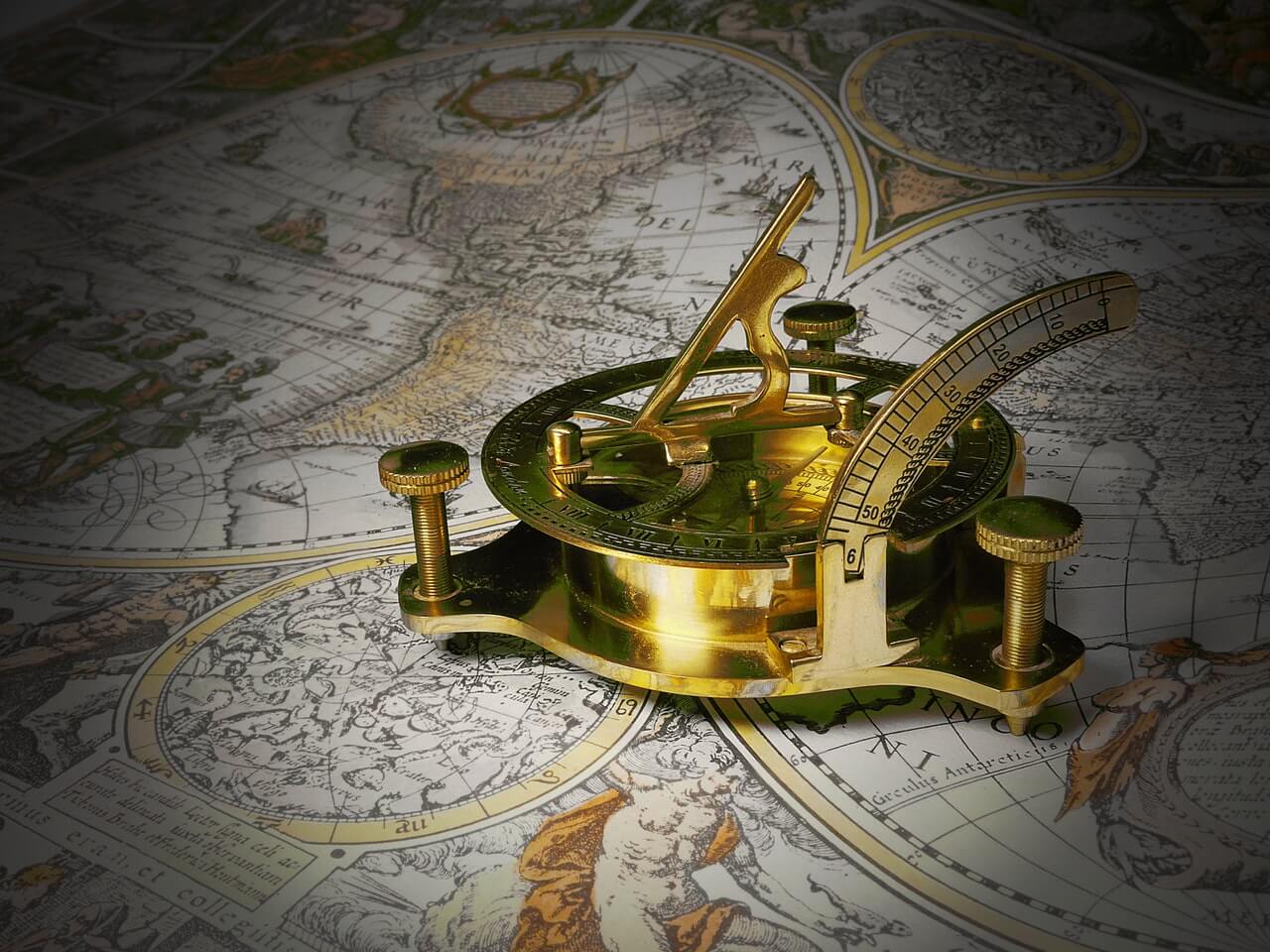
Years ago, I inherited a 400 plus year old edition of what may be the first printed map of Alaska. It was published in the late 1500’s and it shows a coastline, parts of which were informed by observation, via the voyage of a 16th Century English explorer, Martin Frobisher. The general shape of eastern Alaska is recognizable, but what fascinates me most about this map, aside from its age, is the extent to which the cartographer’s imagination graces it. Arctic Northern Alaska, for example, as it’s depicted on the map, is full of things that simply don’t, and didn’t exist, such as churches, villages, coastal mountains and forests, where in truth, most of what was actually to be found was low-lying tundra and ice.
The reason for this is that printed maps were made by hand by artists – engravers, etchers, and printers – and their creation was a long and detailed process; there were no rules dictating how the maps should be oriented or what should be on them. At the time, maps may well have been considered as much works of art as accurate reference documents. The Latin words Hic Sunt Dragones (Here be Dragons) or Hic Sunt Leones (Here are Lions), appear on some early maps together with drawings of sea monsters or strange beasts, perhaps to indicate that danger lurked in these unexplored territories without the cartographer having to visually admit his ignorance by leaving those territories blank when he had no idea what to draw.
I have been fascinated in maps for years because in my mind, they are more than just a history of geography; they are a window into human history as well, since they trace how the human perception of the world grew. Even the basis of the most common map world map today, the Mercator map first printed in 1569, is not an accurate depiction of the world. This is because the map was originally designed to help ships travel in efficient, straight lines by displaying straight horizontal thumbs or latitudes and vertical meridians or longitudes; But if the map is designed to make these lines all meet at right angles, which in reality they don’t, then something else has to be distorted.
The Mercator projection shows Greenland as the same size as South America, whereas in reality, some 14 Greenlands could fit in South America. Alaska is actually far smaller than it appears, and Antarctica, of course, is NOT larger than all the other continents combined. On a Mercator Projection, the closer something is to one of the poles, the larger it appears. Depicting the curved surface of the earth on a flat piece of paper remains a major challenge, and there are now many projection options to choose from, depending on what the map is designed to be used for.
Maps underwent a significant change with the introduction of observational satellites in the 1960s. While governments initially invested in satellite imagery as a way to observe (spy on) enemy nations, that imagery provided governments with the opportunity to make militarily-essential accurate maps of otherwise denied areas. Now, what was only available to limited parts of a small number of governments is essentially available to anyone. With the growth of a commercial satellite industry and the growth of private digital mapmakers such as Google, maps of unprecedented accuracy have become available to anyone.
Next time, I’ll write further about the history of cartography and discuss early significant changes in mapping, early public use of satellite data, and how maps can sometimes be the only way to study history.